


MyExpertWeb Team
August 22, 2026
Common Website Design Mistakes That Hurt Sales: A 2026 Strategic Review
What if your website’s biggest obstacle isn’t a lack of traffic, but the very design you built to welcome it? Many business owners invest heavily in visibility only to wonder why their inquiry volume remains low while bounce rates climb. It’s a common frustration to feel like your digital presence looks amateur compared to sleek competitors, especially when you know your service is superior. In 2026, a website is no longer just a digital brochure; it’s a functional business tool where even minor common website design mistakes that hurt sales can lead to significant financial loss.
We understand that your website should be your most reliable team member, not a source of friction. This strategic review will help you identify and eliminate the hidden design flaws that are quietly driving potential customers away and suppressing your conversion rates. We’ll examine the shift toward high-performance business applications and provide a methodical guide to ensuring your site reflects the professional excellence your brand stands for. By the end of this review, you’ll have a clear path to turn your site into a steady, results-focused ally for your business growth.
Key Takeaways
- Understand how the 0.05-second rule dictates your brand authority and why visual hierarchy is a prerequisite for financial trust.
- Identify and eliminate common website design mistakes that hurt sales, specifically focusing on “invisible” conversion points and complex navigation.
- Learn why a mobile-first approach is mandatory in 2026 and how page speed directly influences a user’s perception of your professional capability.
- Secure your lead volume by implementing visual cues that signal high-level data protection and privacy transparency to savvy modern users.
- Shift your perspective from maintaining a static website to developing a custom business application that functions as a reliable, strategic partner for growth.
The Psychology of User Trust: Why First Impressions Still Matter in 2026
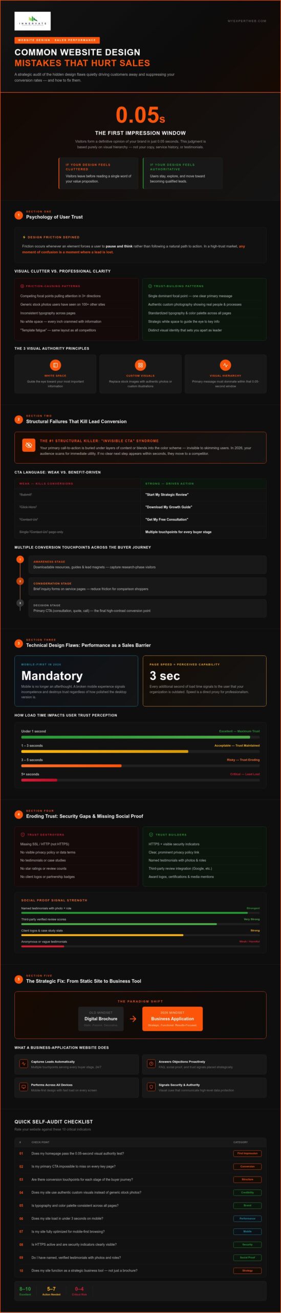
In 2026, user intuition is sharper than ever. Research consistently shows that visitors form a definitive opinion of your brand in just 0.05 seconds. This split-second judgment isn’t based on your copy or your service history; it’s an instinctive reaction to your visual hierarchy. If your layout feels disorganized or cluttered, potential clients won’t stick around to read your value proposition. One of the most common website design mistakes that hurt sales is failing to establish immediate brand authority through a clean, intentional structure.
Professional aesthetics are no longer a luxury. They’re a prerequisite for financial trust. When a visitor encounters a site that feels dated or generic, they subconsciously question the security and reliability of the business behind it. This leads to what we call design friction. Friction occurs whenever an element forces a user to pause and think rather than following a natural path to action. In a high-trust market, any moment of confusion is a moment where a lead is lost. We see this often with “template fatigue,” where businesses use the same overused layouts as their competitors, making it impossible to stand out as a leader in their field.
Visual Clutter vs. Professional Clarity
Effective design uses white space as a strategic tool for information processing. Without it, your message gets buried in visual noise. Competing focal points are a major risk; if three different banners are fighting for attention, the user usually chooses to leave. To build lasting brand recognition, you must standardize your typography and color palettes across every page. This consistency signals that your organization is stable, organized, and methodical. It allows the user to focus on your solutions rather than trying to decode a messy interface.
The Impact of Low-Quality or Generic Visual Assets
Users in 2026 have seen the same stock photos across hundreds of sites, and they’ve learned to associate them with a lack of original thought. Relying on generic assets is one of the common website design mistakes that hurt sales because it erodes credibility exactly when you need to build it. The current shift is toward authentic, custom graphics and high-quality video that show the real people and processes behind your brand. Ensuring visual consistency across all landing pages and subdomains creates a unified experience that reinforces your professional capability at every touchpoint.
- White Space: Use it to guide the eye toward your most important information.
- Custom Visuals: Replace generic stock images with authentic photography or custom illustrations.
- Hierarchy: Ensure your primary message is the first thing users see within that 0.05-second window.
Structural Failures That Kill Lead Conversion Rates
A website’s structure is the functional skeleton that supports your entire sales strategy. While visual appeal captures attention, the underlying architecture determines whether a visitor becomes a lead or a lost opportunity. One of the most common website design mistakes that hurt sales is the “Invisible CTA” syndrome. This occurs when your primary call-to-action is buried under layers of content or blends so perfectly into the color scheme that it becomes indistinguishable from the rest of the page. In 2026, your audience consists primarily of “skimmers” who scan for immediate utility. If your structure doesn’t guide them toward a logical next step within seconds, they’ll simply move on to a competitor.
Relying solely on a static “Contact Us” page is another structural failure that limits your growth. Modern users expect multiple touchpoints tailored to their specific needs. By offering various conversion opportunities, such as brief inquiry forms on service pages or downloadable resources, you capture leads at different stages of the buyer’s journey. This methodical approach ensures you aren’t ignoring potential clients who are still in the research phase.
The Strategic Placement of Calls-to-Action (CTAs)
Effective CTAs move beyond generic commands like “Submit” or “Click Here.” Instead, use action-oriented, benefit-driven language that tells the user exactly what they’ll gain, such as “Start My Strategic Review” or “Download My Growth Guide.” Visual contrast is equally vital; your conversion points must be impossible to miss. We often recommend implementing secondary CTAs to nurture leads who aren’t ready for a direct sale. This is where professional landing page design and development becomes a critical tool for capturing and converting middle-of-the-funnel traffic.
Simplifying Complex Site Navigation
The “Paradox of Choice” remains a significant barrier to sales. When a navigation menu offers too many options, users often feel overwhelmed and abandon the site entirely. While the “Three-Click Rule” has evolved alongside more complex business applications, the core principle of minimizing friction still applies. If you have a wide range of services, use “Mega Menus” carefully to categorize information without cluttering the screen. Including breadcrumbs and a robust internal search function helps users find exactly what they need without having to restart their journey from the homepage. A streamlined navigation path demonstrates that you value your client’s time and expertise.
- Action-Oriented Language: Replace passive buttons with verbs that imply progress.
- Logical Flow: Ensure every page leads to a clear, singular objective.
- Navigation Breadcrumbs: Provide a clear trail so users never feel lost in deep content layers.
Technical Design Flaws: Performance as a Sales Barrier
Performance isn’t just a backend metric; it’s a vital part of the user experience. When a page takes too long to load, your potential customer assumes your business processes are equally sluggish. One of the common website design mistakes that hurt sales is treating speed as an afterthought rather than a core design requirement. In 2026, technical debt often hides within the design layer itself. Excessive scripts, unoptimized visual elements, and heavy animation libraries create a slow-moving sales funnel that frustrates users before they even see your offer.
Core Web Vitals now serve as the definitive benchmark for both SEO and direct user conversion. These metrics provide a clear view of how a site performs in the real world. If your design layer is too heavy, your bounce rates will climb regardless of how professional your graphics look. High-performance design ensures that every technical element supports the user’s journey rather than obstructing it. We focus on building sites that load with quiet confidence, proving your reliability before a single word is read.
The High Cost of Poor Loading Times
There’s a direct, measurable correlation between server response times and lead abandonment. If a visitor has to wait more than a couple of seconds, the psychological bond of trust begins to weaken. Largest Contentful Paint (LCP) represents the moment the largest visual element on the screen is fully rendered, signaling to the visitor that the site is ready for use. While many businesses rely on generic CMS platforms, custom-coded solutions often provide a significant advantage by eliminating the bloat of unnecessary plugins and themes, resulting in a leaner and faster experience.
Mobile-First Failures in a Multi-Device World
In 2026, simply having a “responsive” site is the bare minimum. You must design specifically for “The Thumb,” ensuring that critical interaction points are placed within easy reach of a mobile user’s natural grip. A frequent failure occurs when desktop content is simply squished onto a smaller screen, leading to tiny, unclickable buttons and illegible text. True mobile-first design prioritizes functionality on handheld devices while ensuring a seamless transition for users who might research on their phone but prefer to complete a complex conversion on a desktop.
- Optimized Assets: Ensure all visual elements are compressed without sacrificing clarity.
- Clean Code: Minimize technical debt by avoiding excessive third-party scripts.
- Adaptive Layouts: Design for specific device behaviors rather than just screen sizes.
Eroding Trust: Security Gaps and Missing Social Proof
In 2026, trust is the primary currency of the digital economy. If your website projects even a hint of insecurity, visitors will vanish before they ever see your call to action. The “Sketchy Site” effect is a common psychological reaction to visual cues that signal a lack of professional oversight. Outdated copyright dates or broken links are common website design mistakes that hurt sales because they suggest a business that is either struggling or inattentive. Corporate authority is fragile; it takes years to build but only seconds to lose when a user encounters a 404 error on a critical page.
Modern users are more privacy-conscious than ever. They don’t just want a product; they want to know their data is handled with professional care. Transparency isn’t just a legal requirement; it’s a competitive advantage that builds a foundation for a long-term partnership. When your design fails to prioritize these elements, you aren’t just losing a click. You’re losing the opportunity to establish yourself as a reliable leader in your industry.
Security Red Flags: Why Users Won’t Submit Data
A “Not Secure” warning in a browser is the ultimate conversion killer. It triggers an immediate psychological rejection that no amount of persuasive copy can overcome. To counter this, you need to embed secure web application development principles directly into your user interface. This means making your security certifications and privacy policies visible without letting them clutter the design. Modern users demand transparency about how their data is handled. If they don’t see clear evidence of protection, they won’t fill out your inquiry forms or trust you with their business information.
Leveraging Social Proof Strategically
Many businesses make the mistake of hiding their best evidence on a dedicated “Testimonials” page that few people visit. In 2026, social proof must be integrated directly into the conversion path. This is especially true for B2B environments where high-level decision-makers look for real-world results. Use detailed case studies and borrow authority by displaying logos of established partners or industry certifications near your primary CTAs. This methodical placement of proof points helps overcome the final hurdles of skepticism.
- Live Trust Signals: Use real-time security badges to reassure users during the data entry process.
- Contextual Proof: Place relevant client quotes next to the specific service they describe.
- Authority Logos: Display certifications to show your commitment to industry standards.
If you’re concerned that hidden friction points are quietly driving your customers away, our team can help you implement a comprehensive digital security and design audit to restore your brand’s authority.
The Strategic Fix: Moving from a Website to a Business Tool
A website in 2026 shouldn’t be a static destination. It must function as a high-performance business tool that actively facilitates growth. When you audit your current design, you’re looking for “Sales Leaks,” which are those specific points where technical friction or confusing layouts cause a lead to drop off. Correcting common website design mistakes that hurt sales isn’t just about aesthetics; it’s about engineering a path that makes it easier for your customers to say yes. We view this process as a methodical refinement that turns your digital presence into a reliable extension of your sales team.
Moving beyond a traditional site often involves a transition to a custom business application. This shift allows your digital presence to handle complex tasks, from automated lead qualification to seamless client onboarding. While a “DIY” approach might seem cost-effective initially, it rarely scales with the needs of a sophisticated business. A professional partnership provides the methodical guidance needed to ensure your design remains an iterative growth process rather than a one-time project.
Identifying and Prioritizing Design Fixes
Data should drive every design decision you make. Using tools like heatmaps and session recordings allows you to see exactly where users hesitate or get stuck. We look for the “Low-Hanging Fruit” first, such as small changes in CTA placement or form simplification that provide an immediate return on investment. This methodical approach ensures your design roadmap is perfectly aligned with your broader SEO strategy, creating a unified front for both visibility and conversion.
Scaling with Professional Development Support
Maintaining a modern tech stack requires consistent effort and specialized expertise. Many growth-focused companies utilize offshore dedicated development teams to scale their capabilities without the overhead of local hiring. This partnership model allows you to focus on your core business while experts handle the technical nuances of your digital presence. When you treat design as a strategic investment, the resulting improvement in lead quality and operational efficiency ensures the redesign pays for itself over the long term.
- Data-Driven Audits: Use heatmaps to find and plug sales leaks in your current layout.
- Functional Evolution: Transition from a static brochure to a custom business tool.
- Scalable Support: Leverage dedicated development teams to maintain high performance.
- Iterative Growth: Treat your website as a living asset that requires continuous optimization.
Turning Digital Friction into Strategic Growth
Identifying common website design mistakes that hurt sales is the first step toward reclaiming your conversion potential. In 2026, your website must be a high-performance business application that builds trust through speed, security, and intuitive navigation. We’ve explored how small friction points, like invisible CTAs or sluggish mobile layouts, can quietly undermine your marketing efforts. By shifting your perspective from a digital brochure to a functional business tool, you create a foundation for long-term scalability and consistent lead generation.
MyExpertWeb brings 12+ years of experience to every project, focusing on secure, scalable custom software that drives results. Our team has a proven track record in national lead generation, helping businesses move beyond generic templates toward high-performance applications. You can book a free consultation with MyExpertWeb to audit your site for conversion leaks and begin the process of refining your digital presence. We’re ready to help you build a more resilient and profitable future.
Frequently Asked Questions
What is the most common website design mistake that hurts sales?
The most common website design mistake that hurts sales is failing to provide a clear, visible path to conversion. If your call-to-action buttons blend into the background or use passive language like “Learn More,” users often lose interest. A successful design guides the eye toward a singular, high-value action. When visitors have to hunt for a way to contact you, they typically choose the easier path and leave your site.
How much does a slow loading speed actually cost my business?
Slow loading speed directly impacts your bottom line by increasing abandonment rates before a user even sees your offer. Industry data suggests that even a one-second delay can significantly reduce conversion rates as users equate technical lag with a lack of professional reliability. In 2026, visitors expect near-instant responses. A sluggish site doesn’t just lose the immediate sale; it damages your brand’s reputation for efficiency and modern capability.
Can a bad website design affect my SEO rankings in 2026?
Poor design significantly affects SEO because search engines prioritize user experience metrics like Core Web Vitals and bounce rates. If your layout is cluttered or difficult to navigate, users will leave quickly, signaling to search engines that your content isn’t valuable. Google’s 2026 algorithms place heavy emphasis on mobile usability and page speed. A design that creates friction for the user will eventually result in lower visibility in search results.
How do I know if my website navigation is too confusing for users?
You can identify confusing navigation by analyzing high bounce rates on key landing pages and using tools like heatmaps or session recordings. If users are clicking on non-interactive elements or repeatedly returning to the homepage, your menu structure likely lacks clarity. Methodical testing often reveals that offering too many choices leads to decision paralysis. Simplifying your menu to focus on primary user goals is a reliable way to improve the overall flow.
Is mobile-first design really necessary for B2B companies?
Mobile-first design is mandatory for B2B companies because decision-makers often conduct initial research on handheld devices during their commute or between meetings. While the final conversion might happen on a desktop, a poor mobile experience will disqualify your brand early in the process. In 2026, “responsive” isn’t enough. You must ensure that your site is fully functional for thumb-driven navigation to maintain a professional image across all touchpoints.
What are the essential trust signals every business website needs?
Every business site needs a visible SSL certificate, current security badges, and integrated social proof like case studies or client logos. These signals reassure users that their data is protected and that your business is a reliable partner. Including a clear privacy policy and transparent contact information also helps eliminate the “sketchy site” effect. Without these elements, even the most modern aesthetics won’t be enough to overcome a user’s natural skepticism.
How often should a business update its website design to stay competitive?
Rather than waiting for a total overhaul every few years, you should treat your website as a living asset that requires continuous, incremental optimization. A major strategic review is typically necessary every two to three years to keep pace with evolving technical standards and user expectations. This proactive approach prevents the accumulation of technical debt. Regular updates ensure your site remains a steady, results-focused ally rather than an outdated digital brochure.
What is the difference between a website and a custom business application?
A website is primarily a source of information, while a custom business application is a functional tool integrated into your operational workflow. Applications handle complex tasks like automated lead scoring, client portals, or real-time data processing. While a standard site might showcase your services, an application actively manages business processes to improve efficiency. Moving toward a custom application is a strategic way to address common website design mistakes that hurt sales by automating the user journey.